MINERVA CONNECT
Designed a platform that inspires and empowers girls to advance their careers through mentorship connections.

WHAT IS MINERVA CONNECT?
Minerva is a registered, non-profit charitable organization that supports women and girls throughout the province (BC) to gain the confidence and skills they need to reach their leadership potential. It works for the welfare of society that empowers young youth to be more confident. Their unique programs help to develop leadership capabilities that enhance their career growth.
My contribution
• Prepared gut tests to understand our client’s likes and dislikes by showcasing a few designed layout samples.
• Tried different design iterations for the app according to the brand guidelines of Minerva.
• Searched for the icons and typography best suited based on the project requirements. Adjusted the icon’s strokes on adobe illustrator to make the design consistent for the app throughout.
• Designed the library elements on the sketch tool for the hi-fidelity wireframes.
• The total number of screens for the app including the overlays were 86 wireframes in which I designed 43.
• Linked 86 screens to the sketch and pushed it to InVision for the clickable prototype version to be presented in front of clients and developers.
• I talked about the visual aspects to share a story of “why” we chose this design layout.
• Played a major role in the smooth handoffs to the developer team just to make sure everything is aligned and files are named properly to exclude any state of confusion.
Goals
User
Become more confident and empowered by meeting with like-minded people
Business
Generate donations to drive impact and engagement
Research
We had a client meeting where we understood and deep-dived in their mission and vision statements.
Client meeting
After the meeting, the UX team started the competitive comparative analysis to get more details on what we had to create and design within a given period of time. Also, on the other hand, the UI team focused on the visual elements of the apps our client suggested to look at.
Gut test
Besides looking at the design layouts of the apps. We performed 20-minute gut tests on our client. We prepared two tests for our client, one for the layouts and another one for the typefaces, colours, and iconographies.
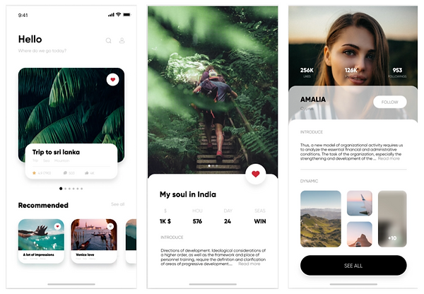
Likes
This layout style was the favourite amongst all the designs we showed to them. They liked the consistency & round edges of the images and buttons on the app throughout. Also, received feedback from the client, this is organized, simple, clean and fun to use.
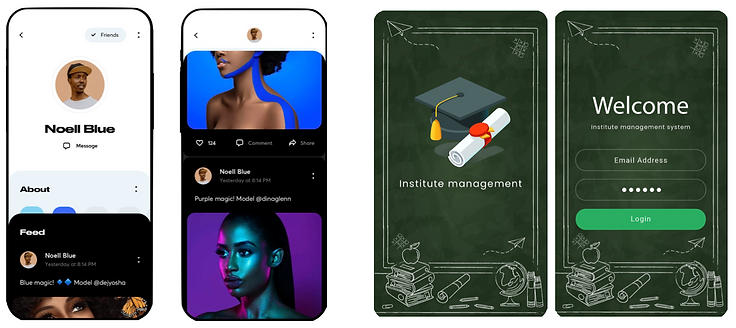
Dislikes
The app design above was least liked by our client. They said the design unorganized and inconsistent throughout. The first layout on the left has whitespace at the top and then half portion is too dark. They did get a sense of Minerva’s feeling from it.
The second layout on the right has a very academic feel and illustration designs aren’t consistent.
Planning
In the planning phase our UX teammates came up with the User Personas and their pain points which represent the users we had to design for the product.
User Persona
Girls from the Learning to Lead program want to easily stay connected and maintain relationships with the Minerva community and currently don’t have a secure platform to do so.
Mentor
Meet Hannah Smith, who is a 19 year old high school graduate. She is an ex-Minerva student and wants to guide school girls in their career and make them confident future leaders.

Student
In the planning phase our UX teammates came up with the User Personas and their pain points which represent the users we had to design for the product.

Design inception
After the gut test, we started our planning phase where the initial UI process is to find the direction by firstly figuring out the “why-statement” which is super important in the UI side and is the most difficult thing to come up with the best why statement. Followed by the mood of the design and then deciding the visual language like shape, space, colour, and movement of the app being designed.
The why statement
“A safe and friendly platform to connect and empower girls”
To give our client options for the app design, we worked in two different directions. Our client selected ‘direction one’ as it was empowering and confident whereas direction two had a more homey/ friendly feel.
Moodboard
Mood board is a collection of various photos to visualize ideas and concepts behind the digital web/app designs.
To give our client options for the app design, we worked in two different directions. Our client selected ‘direction one’ as it was empowering and confident whereas direction two had a more homey/ friendly feel.
Direction 1

Mood: Confident, Connected, Polished, Empowered, Elegant, not uptight, Young.
Space: Open, Dynamic, Positive, Clean.
Shape: Round edges and outlined
Movement: Flowing, graceful and gentle
User feedback
We did a couple of user testing for the mood board just to get the feeling of the users “what they feel when they look at it”.
A few adjectives suggested by users for the moodboard are:
Connection, Supportive, Warm, Confident, Education, Lead, Growth, and Social
Typeface
For the second direction, we kept the typeface Lato typeface has semi-rounded details which gives warmth feeling. We chose Lato-bold for titles, header as Lato-semibold and Body text as Lato-regular.
Buttons
In the gut test, they liked the round edge buttons so we kept the edges rounded. The primary button was gradient with green and blue shade whereas the secondary was gradient with just blue solid colour.
Icons
We searched for the outlined icons that convey an idea of elegance and openness. After having some options, we made them consistent among each other by adjusting line thickness and making sure they look consistent.
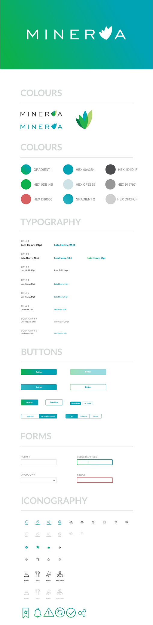
Style tile
Style tile is a design deliverable that allows designers to conceptualize potential visual directions for their high-fidelity designs.

Final iOS UI prototype
Team UX handed over the Mid Fidelity sketch version file to the UI team to make it High Fidelity. We received the wireframes in the 3rd week and we had 86-wireframes for skinning. We were slightly overwhelmed because of the time constraints and amount of work we had to deal with.

Style guide
Style guide is a mixture of design principles, visual guidelines and example components (often images of components) which help inform layout decisions.
Future consideration
Adding social event options to the app will promote the brand name Minerva and will make young girls aware of where to seek help when they need it for their career.
Adding to the course details, Minerva will be more appropriate and approachable to the users.
In the message/chat section, adding document pins to share files and documents will be helpful for girls to get the resources easily accessible.
Safe ways to send invitations to new members on the app.
Conclusion
I am excited to share that our project Minerva Connect was internally chosen to be developed by the RED Academy’s Developer team.
The team collaboration worked well and I had a great learning exposure with all my team members. We completed the project on time and I thank my folks for being supportive and positive throughout. Also, I am thankful to the instructor for allowing us to work on such an amazing project.
Next project
Pace society
Redesigned an online platform to spread awareness to the general public about the stigmatized sex industry and provide workers a safe and intuitive way to easily report any unethical treatment by the customers.